Activity Details
The Activity Details screen allows you view the finer details of recorded ride.
You’ll need to be a subscriber to our platform to get access to this level of information.
Please note, these images deliberately do not match each other, as it is real horse data from a number of high performance horses.
Speed and Heart Rate sectionals
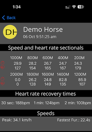
1. Speed and heart rate sectionals Displays the average pace (seconds to the furlong) and average heart rate for each sectional calculated backwards from when the jockey crossed your finish line.
If you did not cross a known finish line, the finish point is taken as the fastest point in the ride.
We calculate for multiple laps, but display the fastest one here. The system will attempt to calculate to a distance of 10 furlongs back from the finish point, if enough data exists.
2. Heart rate recovery times Given the point you crossed your finishline, an assumption is made that you are then pulling the horse up in a controlled manner, and we then calculate heart rates at various points afterwards.
We display the hear rate at 30 seconds, 60 seconds, and 2 minutes.
A common check is that the horse is under 100 bpm in less than a minute after slowing from a gallop. This will obviously change depending on the speed the horse is pulled up, and what ground is covered after crossing the finish point.
Speeds
Peak: The fastest recorded speed in the entire ride
Fastest fur: the fastest furlong in seconds in the ride. This furlong is not tied to a specific sectional, it can happen anywhere within the ride. Hopefully, it has happened somewhere near the finishline, and does not cross over the finishline. See the map for more information.
Speed and Heart Rate graph
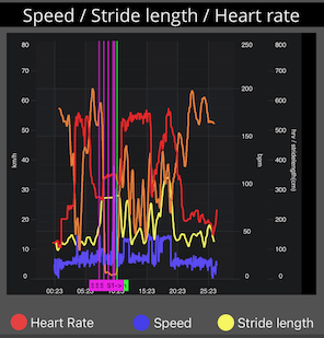
The speed and heart rate graph plots speed, heart rate, stride length, and HRV over time through out the ride.
The sectionals and finish line are also plotted on the graph to so you can see how the horse performed over the most important section of the data.
You can pinch to zoom on the graph to see more details. This will also trigger an update of the map and other graphs to reflect the selected piece of data.
Location
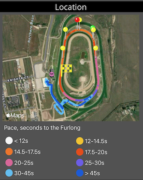
Location displays a map of the entire ride. It plots the finishline (finish flag icon), and the sectional points calculated back from the finish line (yellow drop pins).
It also marks the beginning (green drop pin) and end (red drop pin) of the fastest furlong through out the entire ride. Ideally this is somewhere just before the finishline, depending on how you want your jockey to time their run to the post.
Each point on the map is assigned a color that corresponds with the speed, so you have a quick visual representation of which pieces were fast, and which were slow.
Motion Analysis
The next graphs display motion data if you have our used our motion sensing fetlock boots during the ride. If you have not used any, these graphs will be blank.
Fore Balance
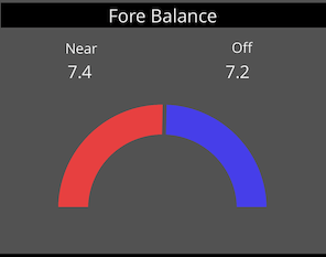
The Fore Balance graph gives you a very quick indication as to whether your horse is “balanced”. it graphs the ratio of vertical impact on the front left leg vs the front right.
For example, a horse that is sore in the left, will often display a much greater value in the right, and the case of the image above, the red line would only extend to about the 10 oclock position (75% of the ring would be blue).
Conversely a horse that is sore or otherwise protecting (not loading up) the right, will display a much greater value on the left. 75% of the ring would be red.
A horse that is showing the two sides fairly closely matching each other, is “balanced”, and shouldn’t be suffering from any obvious imbalances. This does not mean that both front limbs arent sore to the same degree though.
It’s always very important to use these graphs in conjunction with doing your normal visual checks of a horses soundness.
Fore Heatmap
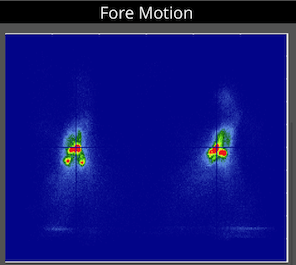
The heatmap shows a graphical representation of how the front hoofs are moving over the ground. Typically the two sides are cigar shaped, showing movement from front to back. This graph is a very quick way to see differences between left and right, or changes over time.
You can compare horses, however we find that most horses, like every other animal each have their own unique movement pattern (finger print). This may change over time, and this is generally what we look for, changes over time, especially dramatic changes, like one side changing from a cigar shape to a circle.
Fore Impact
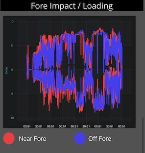
The fore impact graph charts the maximum deceleration and maximum acceleration during each stride, and then graphs this as an upper and lower line for both left and right. The left is in red and the right is in blue. As the stride impact increases, that upper and lower lines will spread further appart (galloping) where as a simple gentle walk will have the upper and lower lines very close together. This data is what is behind the Balance chart above, but in much more detail.